
Design Tips for Handling New FDA Menu Labeling Changes
Wednesday , 22 June 2016 | store decor, graphics and signage, tips, fast casual
The FDA's guidelines for menu labeling have some restaurants scrambling to post nutritional information on their menus. Yes, the law was passed in 2010, but this month's anticipated release of the FDA's Notice of Availability for the nutritional guidelines means that the restaurant industry has only one year to comply with the legislation's edicts.
Failure to adhere to the FDA's demands can mean that any food that's not properly labeled would be considered misbranded. What does this mean for you? Well, for starters, noncompliant food will be seized or condemned, and that's just the start. It could be serious trouble for merchants who fail to properly display accurate nutritional information on the menus.
This is a good time to revisit our tips for effective menu board design. As long as you're redesigning for FDA compliance, you might as well make sure that your menu board looks its best as it adheres to the letter of the law by labeling how many calories are in a pepperoni pizza. You and your printing partner can work together to come up with some creative solutions for your menu update; here are our suggestions for the most effective and attractive menu board designs.
1. Keep it Simple
When designing a menu board, remember that simplicity is in and clutter is out! Negative space around text and images is vital for readability. Choose a text that can be easily read from a distance—your customers that are waiting at the back of the line will thank you.2. Create a Hierarchy of Text
Make the selection process easy for your customer by establishing hierarchy. Each category should use the largest text, sub-categories the second largest, and any item descriptions should be the third largest. Reinforce the larger texts with bold lettering to really make them pop!
3. Get Creative
Draw attention to particular food or specialty items by featuring them in a unique way. Certain design techniques can be used to attract the eye—use interesting fonts, bolded fonts, highlighted text, food illustrations, and photos. Be careful not to use TOO many fonts; we recommend not using any more than four font styles.
4. Materials
Determining where your menu board will be placed is essential. Whether it is being placed outdoors or indoors—consider a material that's durable and can withstand the elements, including rain, direct sunlight, or harsh lighting.
5. Flexibility
Think about how your menu board will be used long term. If your menu board pricing will be updated frequently or if additional legislature could cause the need for changes, consider a channel system where certain categories or areas can easily be replaced. This will save you time and money down the road.
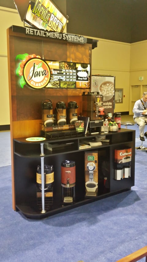
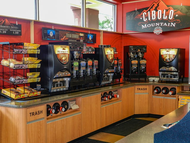
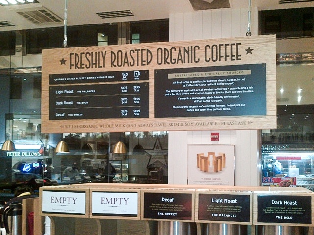
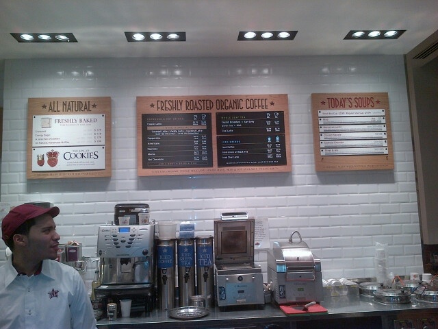
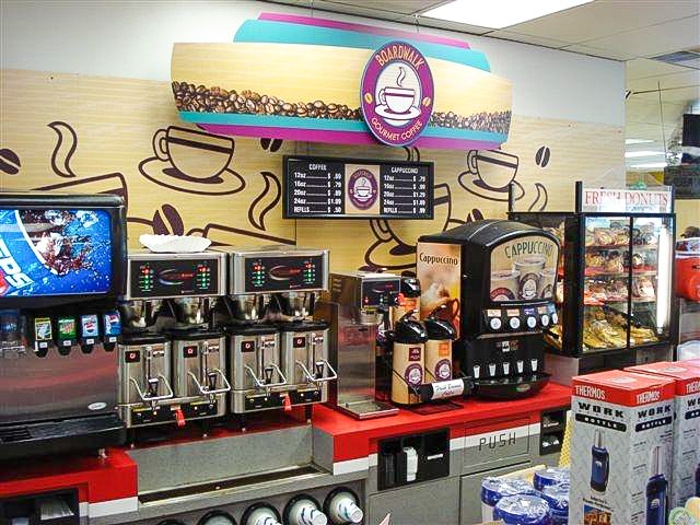
View a few examples of work below and let us know if we can help you with a creative solution for your menus!
Jun 22, 2016 |
Topics: store decor, graphics and signage, tips, fast casual

