Top Wayfinding Signage Tips for Retailers
Tuesday , 30 October 2018 |
Wayfinding signs play a large role in the customer experience. We can all relate to the frustrations of searching for that one item, or trying to locate a hard-to-find restroom. On the other hand, we can also relate to that pleasant experience of walking into our favorite store where everything feels right. Retail store decor and wayfinding signage contribute to these feelings and make customers want to return to that familiar, enjoyable place again and again. We've worked with retailers of all types, from large national retailers to small, locally-owned shops, and we've run into every kind of signage challenge you can imagine. Here are a few of our top tips for designing and executing flawless, creative wayfinding signage:
1. Plan and Observe
Planning and real-world observation is critical for a pleasant customer experience. Work with experts who understand wayfinding signage best practices, creative design, and flawless execution. Your print provider should be experienced in creating the right sign for a variety of environments.
Continuity is very important in wayfinding signage. Signage should have consistent design and branding throughout the retail space, so things do not look piecemeal or ad hoc.
Finally, observe your customers and visitors in the space. Identify the areas where guests have trouble and log their questions. Their feedback, questions, and observations will make a big impact in your planning.
2. Getting the Entryway RightIs your store making a great first impression with customers? Or is it turning shoppers away? The entry point of your store, in fact the first 10 to 20 paces into the store, hold the most crucial elements in forming consumer perception and mood. You'll notice in the photo above a clear and open space in the entry, a recognizable path, and signage in the distance. This is an example of a great entry space. [image]
Even though it's important to get these details right, retailers often make mistakes when it comes to designing the entrance space of their stores. While every retail space presents unique challenges, studies of consumer behavior point to some basic design guidelines to follow. This can make the difference between keeping shoppers in the store longer, or making shoppers uncomfortable and shortening the experience. Read more: mistakes to avoid when it comes to your store's entrance.
3. Easy to See, Easy to Read.Wayfinding signage must be easy to see and read at a distance. Your print partner can help guide you toward creative solutions for great readability and design. When reviewing the design, check the following:
- Is it easy to read?
- Are the fonts and colors appropriate for best legibility?
- Are the dimensions right for the space?
- Can it be moved easily?
4. Light It Up!
Backlit signs and new LED technologies offer endless creative opportunities for wayfinding signage. These eye-catching designs might be exactly what you need for a problematic space that is hard for your customers to find.
5. Interactive Digital Wayfinding
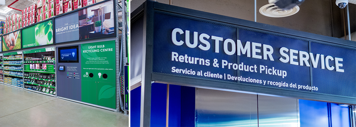
Some retailers are turning to digital solutions to help customers wade through complex content and decisions on their own. For example, this light bulb interactive display.
A major home improvement retailer completely redesigned their light bulb aisle and created an iPad display to dramatically simplify the product selection process. Engaging visuals, digital signage, and interactive tablets come together to form ‘The Bright Idea’ Lighting Education Center—including a ‘Bright Idea’ software app that filters hundreds of products in 7 simple feature sets, turning a frustrating experience into a fun and simple one. To further enhance the shopper experience, the custom app was closely integrated with print graphics found in the light bulb product bays. Color-coded messaging on the shelf and in the iPad app, help shoppers find their recommended product quickly and easily.
6. Don't Forget the Walls, Windows, and Floors!
Wayfinding signage doesn't have to be limited to certain spaces! Crafting a smooth shopping experience requires eye-catching window graphics, wall murals, floor, and ceiling graphics. There are many factors that go into a flawless and engaging result. Things to consider if you are designing wayfinding signage for walls, floors or window clings:
- Where will the graphic be placed?
- Is there existing paint or substance that will affect adhesion or is weather a factor?
- Do you want to be able to see through the window cling?
- How long do you want the graphic to stay on the wall/window/floor?
- Who will install the graphics(s)?
Oct 30, 2018 |

