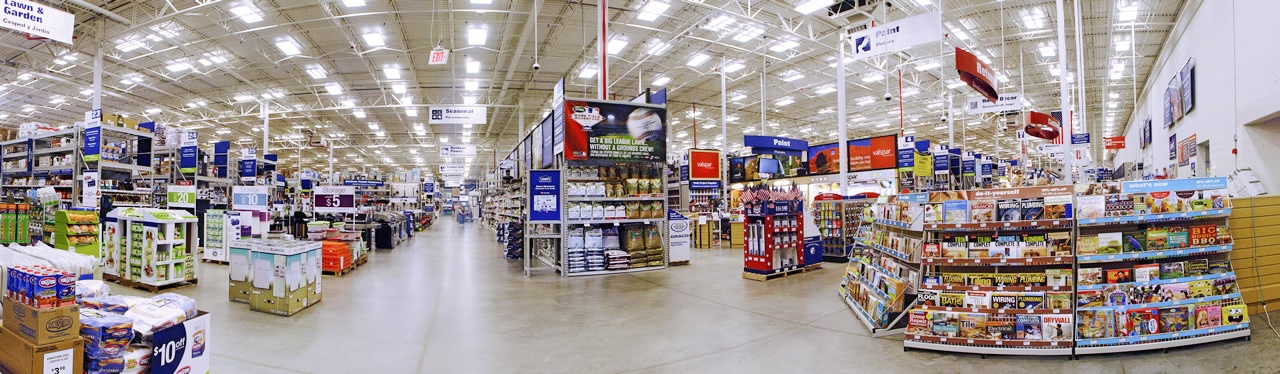
Is your store making a great first impression with customers? Or is it turning shoppers away? The entry point of your store, in fact the first 10 to 20 paces into the store, hold the most crucial elements in forming consumer perception and mood. You'll notice in the photo above a clear and open space in the entry, a recognizable path, and signage in the distance. This is an example of a great entry space.
Even though it's important to get these details right, retailers often make mistakes when it comes to designing the entrance space of their stores. While every retail space presents unique challenges, studies of consumer behavior point to some basic design guidelines to follow. This can make the difference between keeping shoppers in the store longer, or making shoppers uncomfortable and shortening the experience. Here are three mistakes to avoid when it comes to your store's entrance.

1. Cluttering and cramping the entry point.
Less is more when it comes to making a good first impression with your customers. It's a mistake to clutter the entrance of the store and overpower the shopper with information overload. Research shows that displays placed close to the entrance fail to attract much attention. Why is this?
Shoppers need space to transition from the rush of the sidewalk and parking lot. They need "around 10 paces to adapt to the store's lighting, move down through the walking gears" and get into "shopping speed."
This area is known as the decompression zone. By cluttering and cramping this space the shopper will be unable to make a comfortable transition into shopping mode. Make sure you leave plenty of open space in your entrance so that consumers can slow down and adjust to their surroundings.
Here's a great example of enough wide-open space in the decompression zone:
2. Placing important product/signage in the entrance.
Ready to promote some seasonable items or valuable products? The one place you don't want to put them is within that 10-20 paces of the entrance point.
Studies show that by placing this merchandise at the far end of the zone, you can increase sales by at least 30%. These areas are known as "speed bumps" and are placed far enough away from the entrance to give plenty of open transition space, but close enough to attract attention and help the shopper slow down their pace.
In addition, directional signage and displays are more effective further into the store where shoppers aren't affected by the blind spots associated with the decompression zone.
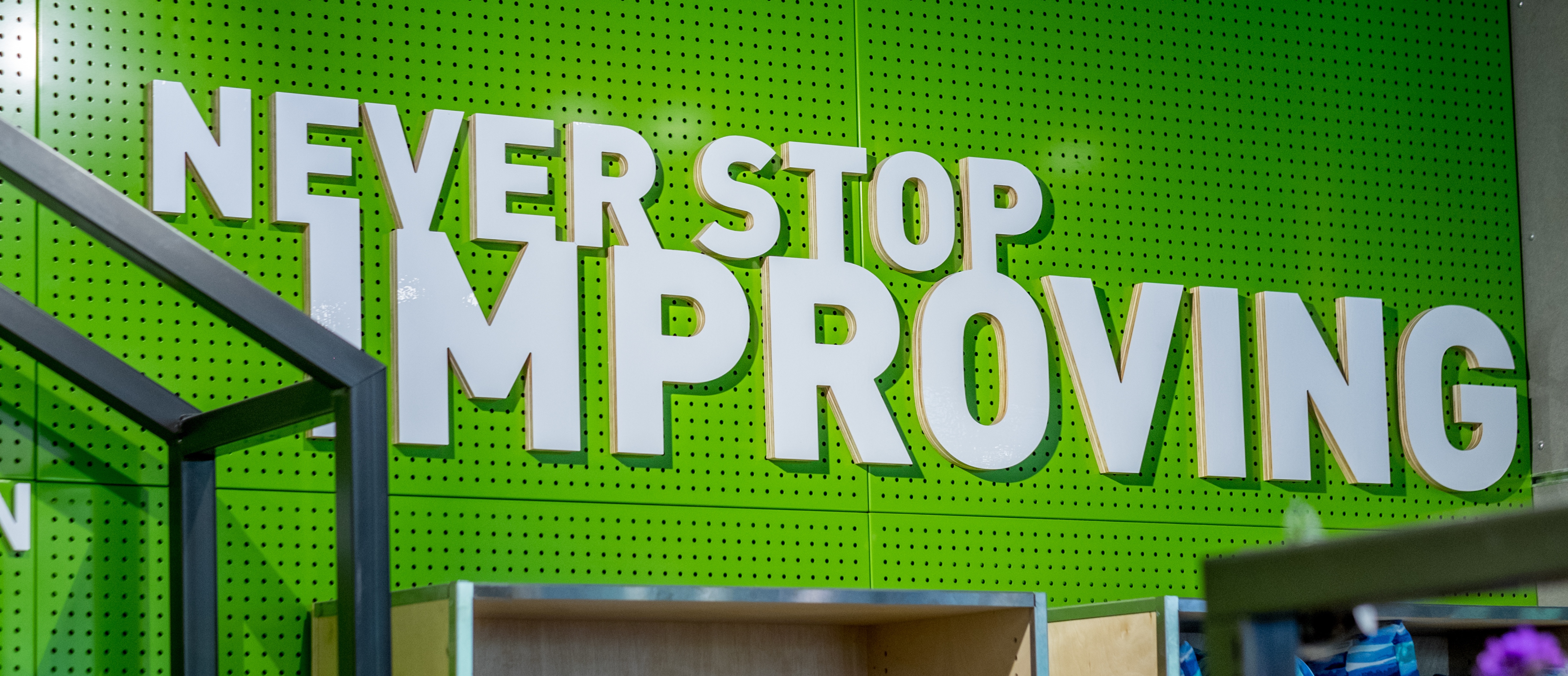
3. Using an imbalance of bold color.
Your store décor package is the first thing consumers notice when they walk in—your color scheme, signage, and fixtures. The right color scheme can promote relaxation, while the wrong palette can cause anxiety. Primary colors (neutrals) should be used in 80 percent of the store to create a relaxed atmosphere for customers to shop, while accent colors (bold colors) can be used in 20 percent of the store’s décor. Accent colors are attention grabbers, and should be used strategically. One example of this is using accent colors on a Power Wall. Expert retail anthropologists suggest using a power wall to the right of the store just after the decompression zone:
"Walk inside your front door, stop just past your Decompression Zone, and look to your right. The wall you see is called a Power Wall and it’s another one of those key merchandising areas. And because it’s the wall shoppers see first after turning right, it’s a perception builder. If you use this area to house basic product you are making a mistake. Put your best foot forward by using this Power Wall to display important departments, new and seasonal items, to create vignettes, tell product stories, and to feature high demand and high profit items."
Here's an example of an attractive power wall, and use of bold color:
By adhering to these rules in your entryway retail store décor, you ensure that the merchandise is the main attraction and that products fly off the shelf. When you need creative solutions for retail signage, store décor, or other elements of your print package, let us know! Our industry experts know the latest trends and strategies that get results.

Jul 17, 2017 |
Topics: Retail