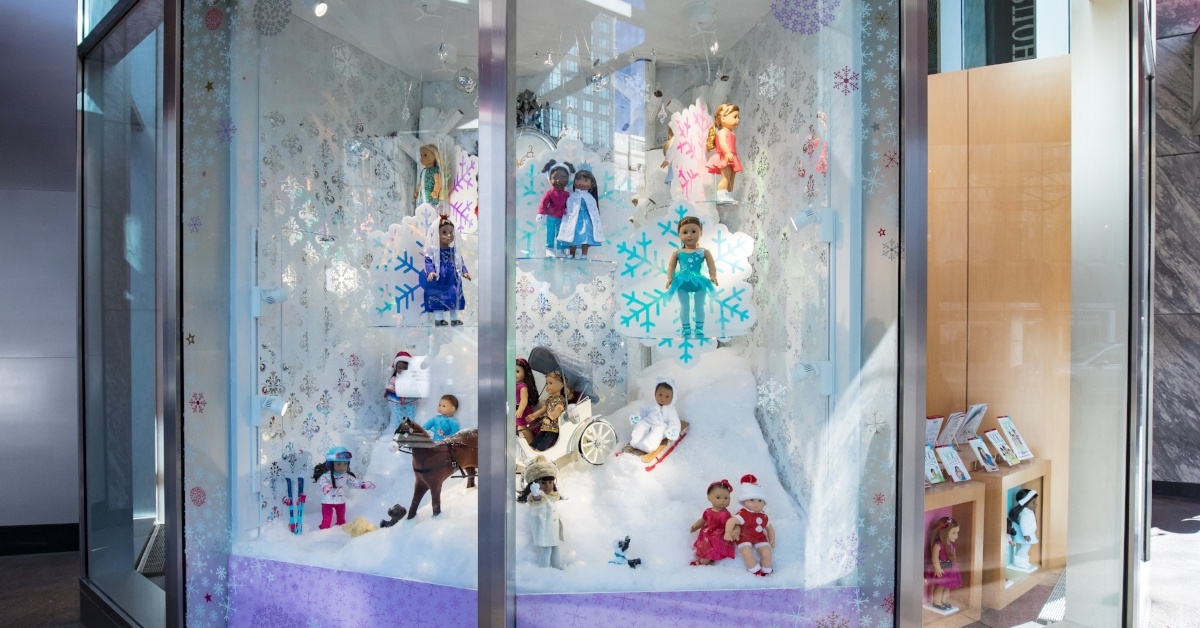
While attention spans seem to be getting shorter, some argue that consumers are just getting more selective. From entertainment to shopping, we have more choices and visual stimuli in front of us than ever before. If we're bored or uninterested in something, we'll turn or click away more quickly. What can you do in the retail space to capture shoppers' attention?
Here are some key factors that should come into consideration when planning your next retail campaign as it applies to store fronts, visual merchandising, and POP signage.
1. SELECT COLORS THAT GRAB ATTENTION, EVOKE EMOTION
Color has the power to stimulate certain areas of our brains and evoke emotional responses. In this fascinating and in-depth article The Psychology of Color in Marketing and Branding, the authors site a study wherein "researchers found that up to 90% of snap judgments made about products can be based on color alone, depending on the product." What are some of the emotional responses and patterns surrounding color?
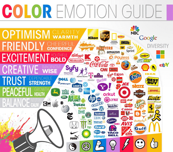
Credit: The Logo Company
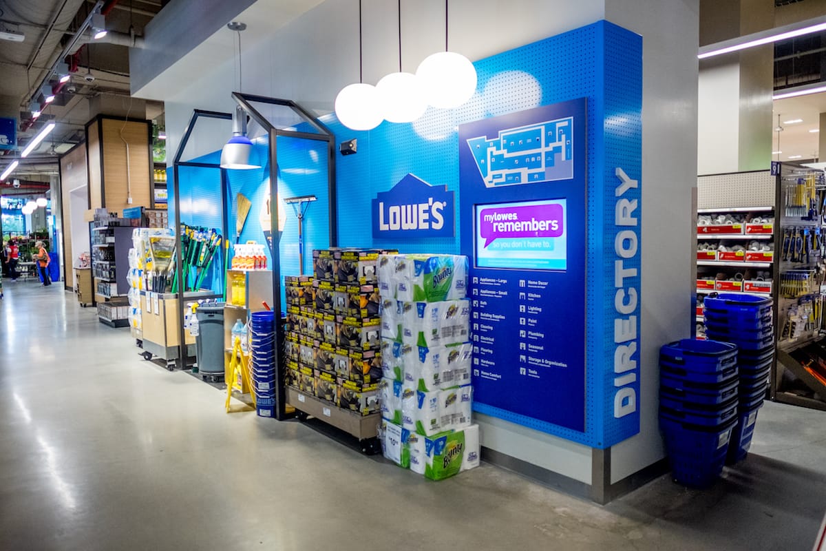
2. POWERFUL SIGNAGE
Use your visuals wisely to communicate any directional, informational, or promotional content, while also keeping it aesthetically pleasing. Humans are picky, so make your window and product displays anything but boring.
3. CHANGE OF SCENERY
Update your window displays often. Window displays can become stale within 2 weeks of installation. Try having a 2 week sale where the deals change on a daily basis; the visuals in your windows can remain the same while your promotional signage is updated each day of the sale. This is exhilarating for the customer and generates a buying decision because the customer knows that the deal will be gone tomorrow.
4. WINDOWS ARE BILLBOARDS
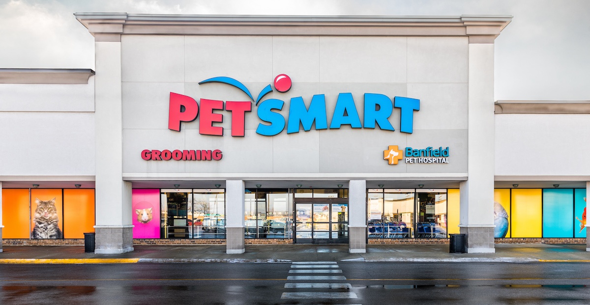
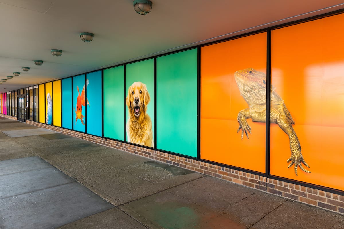
Sure, a window can bring in some natural in-store light, but it can also drive in-store traffic if you employ it properly. Alarmingly, 50% of new customers say they entered a store based on the on-premise signage alone. For optimal results, windows should be fully wrapped in perforated vinyl so that you’re getting the best possible exposure and the in-store customers can still see outside. Another tip is to expand your window murals to the exterior brick with a heat molded adhesive. This breaks your content up from the basic shapes your competitor might have and will draw people in based on visuals alone.
5. BE BOLD
Venture out with all of the substrates and solutions that The Vomela Companies has to offer. Attention spans are dropping, and with people more involved with their mobiles more than ever, retailers need to be daring and bold to grasp their attention and keep it. From metallic vinyl to colored stocks, 3D assembled displays to layered signage to create dimension, we are your resource for creating something clever and engaging.
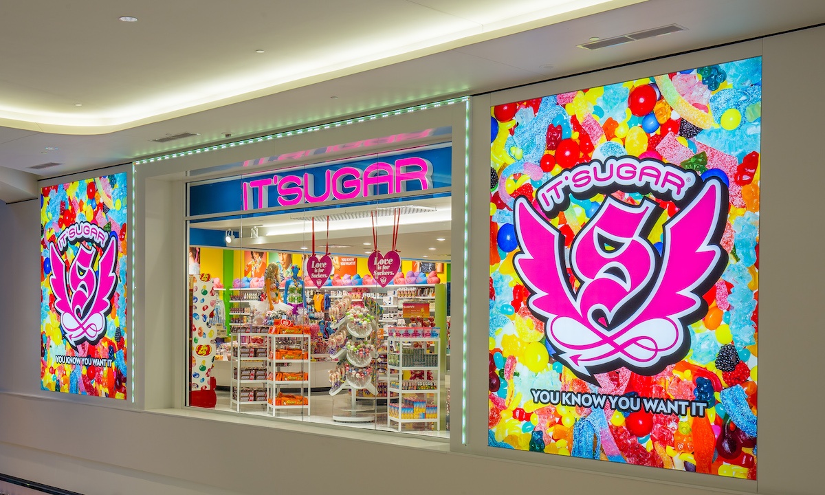
View more of our STORE DÉCOR Portfolio here.

