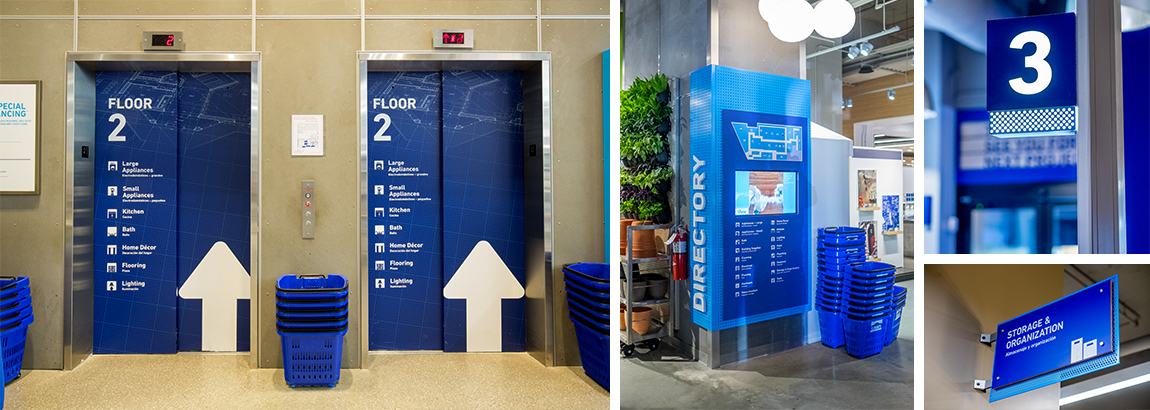
Whether they're finding the cafeteria, winding through the halls, or searching for a classroom, wayfinding signage is essential in guiding children, teachers, and guardians through schools with creative solutions that go beyond the call of duty. We’re taking a closer look at how to create engaging wayfinding signage in educational settings that ensures all who enter the school can find their way around with ease.
Great Signage for Growing Minds
The basic tenet of wayfinding signage still holds true in education settings: The best wayfinding signage is virtually unnoticeable, but people will notice if it's missing. Students and faculty rely on wayfinding signage to navigate the institution throughout the day, but if there's no guidance, it makes things much more difficult, especially for younger students and visiting guardians. Great wayfinding signage seamlessly integrates into its surroundings but remains visible enough to provide vital information.
With education wayfinding signage, schools have a unique advantage over other industries in that bright, engaging colors and over-the-top graphics are encouraged by the people they're intended for. Additionally, where graphics or directing lines might be out of place in other industries, it works especially well to engage students, as the graphics or lines catch their eyes and help direct them to their destinations. Overall, clear, concise signage with clean fonts and minimal verbiage are always great choices.
Don’t Lose Your Way With Wayfinding Design
As with any industry, clear and concise design with crisp lines and bright colors is the most engaging school wayfinding design, but keep in mind a few design traits to avoid.
Hard-to-read fonts are just that; hard to read. With young minds still learning to decipher cursive, throwing a calligraphic font into the mix might be more confusing than engaging. The same can be said for too much text. Keeping wayfinding signage short, sweet, and to the point with lines and directory arrows rather than words will help engage growing minds to pair visual cues with keywords in the signage. Additionally, non-durable substrates often make signage vulnerable to more wear and tear than other display methods.
Brand Your Wayfinding for Students, Not Parents
Students use your wayfinding signage much more than parents, guardians, and faculty, so when considering branding, be sure you’re thinking of the students above all else. Your signage should follow brand standards while being clear to read for the students, but if the brand has a complicated font or hard-to-find colors, changes should be made to ensure the signage is primarily accessible for students. Again, keeping it clean, clear, and concise is key; use simple fonts, clear language, and concise messages to engage students of all ages.
Shift Signage with Your School
Some educational institutions go through the gamut of changes from one year to the next, so installing signage that can evolve with your school will make your budget and your students much happier in the long run. Signage methods that offset the potential costs of rapid changes within your school that affect wayfinding signage include:
- Easy-to-swap hardware systems that can be changed by faculty
- Low-cost materials like PVC signage
- POP and standees signage that can be moved from one place to another
Sustainable signage is key for schools to get the most out of their investment. Using high-quality substrates combined with changeable hardware systems allow for flexibility; no matter where your office or music room moves next, a wayfinding signage installation method like this will make the transition much less stressful.
Start Your School Wayfinding Signage Project Right
When the bell rings and it’s time to go home, it’s about ensuring students have engaging wayfinding signage to help them get from one place to the next as seamlessly as possible throughout their days of learning in school. Keep these tips top of mind as you begin your next education wayfinding signage project:
- It can be as creative as you want; Floor graphics are a great option for teaching children to follow directions, and easy language is key to building children’s reading comprehension.
- Children work hard to play hard, and as they play they can be hard on graphics - be prepared to swap graphics often or use durable substrates.
- It sounds obvious, but kids are short, so always remember to install wall graphics at lower heights.
Want to learn more about The Vomela Companies education wayfinding signage capabilities? Check out our Education portfolio.
Apr 24, 2019 |
Topics: education


