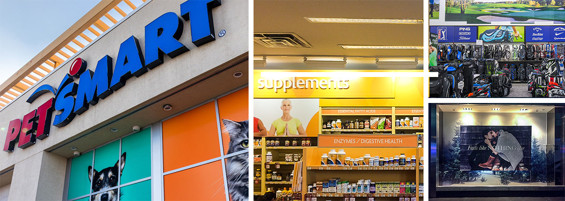
Experiential graphics and signage make a difference when customers visit retail stores, but relying on one big, spectacular graphic to tell your brand’s story won’t cut it. The retail experience goes well beyond the entryway, and details matter if you want your experience to be truly immersive.
That said, you also don’t want to overwhelm your customers. So how do you still make their experience memorable and positive? Here are a few suggestions for driving the customer experience through strategically placed graphics and signage:
Build Graphics to Match your Customer Flow
As we’ve mentioned before, there are mistakes you can make when creating signage for entryways. The entryway, though, is just one piece of how your customers will flow into and explore your store.
Yes, setting the right tone from the start is important, but this can most effectively be done before the customer even walks in the front door. Colorful and well-placed signs can attract the customers, but once they’re in, you don’t want to overcrowd the entrance with signage as the customer moves into the "decompression zone."
The decompression zone is exactly what it sounds like. The customer will only just be getting comfortable after they walk in the door and need some space to decompress. This means that any signage at the entrance can be ignored if it wasn’t immediately visible from the outside. However, signage and promotions placed at strategic “speedbumps” immediately after the decompression zone - that is, immediately after the shopper has acclimated to the store - will perform strongly.
Past these important speedbumps, seasonal and promotional signage can be used liberally and as they make sense. Once the shopper has become fully acclimated to your store, they will be more receptive to signage from that point forward. This can be executed to greater effect if you help establish the flow for them, which brings us to the next point.
Help Define Your Customer Flow
If you’re serious about taking your shoppers on a positive branded experience, then making it easy for them to find their way is a must. Shoppers will be more inclined to engage with your promotional signage if they’re not spending mental energy trying to navigate a store.
Your signage for wayfinding must be at least as good or better than your promotional graphics. You can take this to the next level by placing your speedbumps, and therefore your signage, in a way that moves customers to important seasonal or otherwise special promotions as or before they continue the rest of their shopping.
And speaking of seasonal promotions…
Leverage a Retail Printing Partner for Seasonal Promotions
Seasonal promotions and specialized pop-up promotional graphics demand timeliness and quality. There are often small windows of time between seasons and special promotions, making it important that you find a retail printing partner that can deliver signage that is both on-brand and on-time.
Not only will customers respond to timely seasonal promotions beyond your static signage, but they’ll also expect it. The difference between retail experiences can often come down to how well you play to those expectations. Your static image will establish your brand, but taking advantage of rotating promotions will allow it to thrive.
Aug 27, 2019 |
Topics: Retail


