C-Store: Easy-Install Graphics Systems and 3D Prototyping
Wednesday , 25 July 2018 | graphics, print, wayfinding, c-store
Wayfinding signage can enhance or hinder the shopping experience for your customers. Clear, easy to read signage is ideal - but what about the store manager and employees who move those signs as product and display shelves get rearranged? An easy-install, flexible graphics system can make life better for both the employees and the customers.
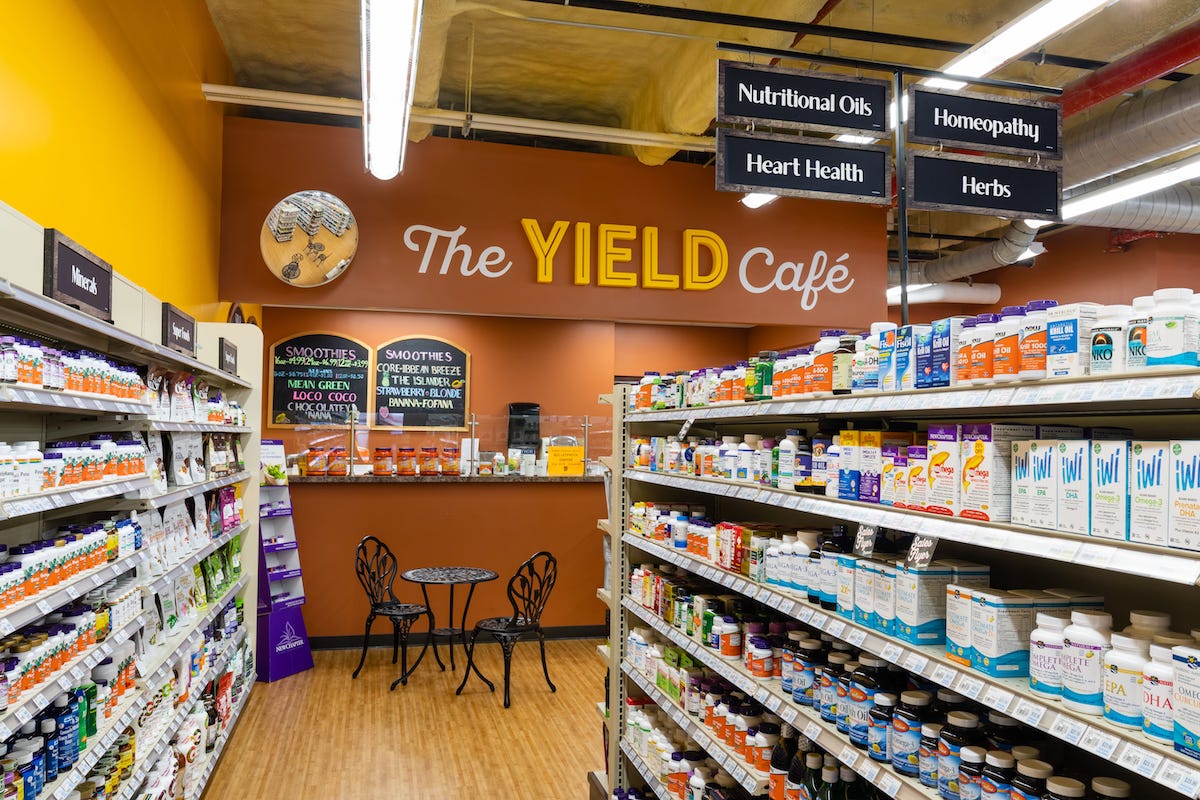
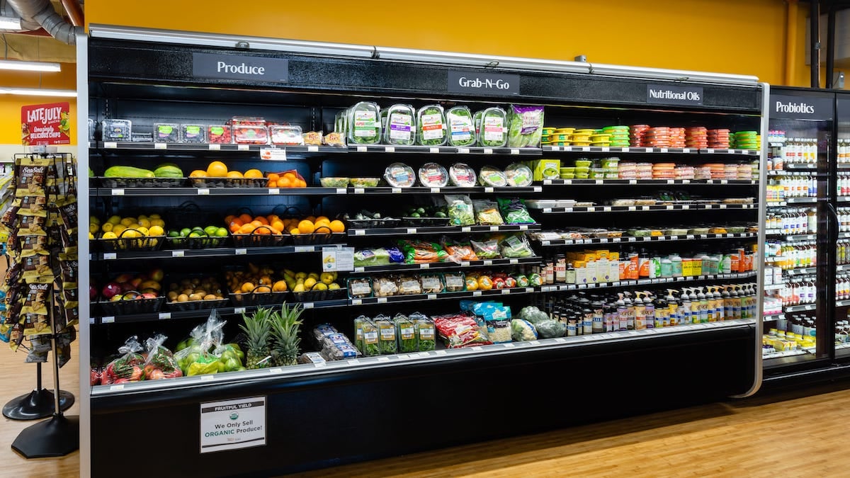
We recently worked with Fruitful Yield on such a graphics system for their prototype store. It's a perfect example of beautiful signage that can easily be moved anywhere in the store. How did we do it?
Many wayfinding signage systems for convenience stores use a slide-in or lift and drop system to swap signs in and out. This client wanted a more refined look and ultimate flexibility for their store signage. In order to achieve exactly what they wanted, we put together a 3D prototype of a magnetic signage system.
The advantage of a magnetic system is that its function is hidden and you're left with a beautiful, crisp graphic—without seeing a plastic sleeve or anything that covers the sign. With this system, we apply films on a variety of surfaces so they can accept magnetic signage. These signs are designed to go anywhere in the store; as items are rearranged, the signs can move as well.

What to Consider When Planning C-Store Graphics Systems
- Ceiling: What color is your ceiling? Height? Visibility around corners?
- Lighting: How will signs look under the light? Is it close to a ceiling, window, or other light source? What kind of light (natural, fluorescent, etc) is right for your space?
- Material, print, & ink: Matte vs. glossy? A glossy print or material may not work well with your lighting. Do your colors contrast in relation to ceilings/walls/window? Will the ink be exposed to sunlight?
- Cost, Quality, Longevity: How long do signs/materials need to last? Budget and use considerations.
- Expectations: Be thorough in considering all of your needs, make sure you and print partner are on the same page.
How We Use 3D Prototyping to Find the Best Solutions
Our process starts with detailed conversations between the client, graphic artists, and our print experts. We start with client objectives and gather detailed information like measurements and photography of the space. Next, we collaborate with the client on different concepts and solutions until we find one that fits the objective, budget, quality and client vision. Finally, we prove out the design using 3D prototyping. Our industrial designers use software to create a realistic 3D version of your product. This gives the client a chance to see the design in the environment and troubleshoot problem areas that may not have surfaced in the earlier concept phase. Our goal is to provide a 3D representation that is as close as possible to what the product will look like in the store. This helps ensure everyone involved in the project is on the same page.
One of the most rewarding parts of the process is when a final product perfectly matches the 3D prototype that we created, as was the case with Fruitful Yield. The account representative at our Pratt location in Indianapolis said that as they installed the signs, customers were shopping and coming up to employees saying how much they loved the new signs and how easy it was to find what they were looking for.


Jul 25, 2018 |
Topics: graphics, print, wayfinding, c-store

