5 Ways Print Can Make Your Event More Inclusive
Wednesday , 08 May 2024 | design, Blog, Events & Exhibits, vomela, print, graphics and signage, healthcare, inclusivity
Think about the graphics and printed items at the last event you attended. Were they easy to interpret, easy to follow, and placed appropriately? Even if all those boxes were checked for you, attendees have varying needs that some of us might take for granted.
It's not possible to create the perfect experience for every attendee. But event planners can plan thoughtfully to make experiences as inclusive as possible. From differing physical abilities to neurodivergence to cultural differences, printed items can play an essential role in inclusion.
1. Designating Plans for Physical Accessibility
Thanks to the Americans with Disabilities Act (ADA), physical accessibility has been a major consideration for event planners for decades. However, just having a plan isn't enough—it’s necessary to communicate the plan to those who need it.
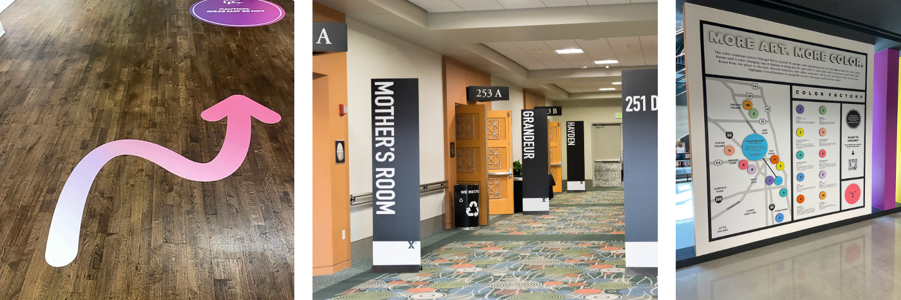
Having wayfinding signage that highlights accessible routes will help attendees with mobility issues find their way more easily. You should also include this information on programs or pocket guides that attendees can carry with them. Make sure to designate elevators, ramps, and other ways to bypass stairs and other obstacles. You can also use floor graphics to show designated areas for wheelchair users in seating areas.
To accommodate attendees with low vision, use large signage with appropriately sized information. Using graphic column wraps can not only provide information but also draw attention to the obstacles. Making thoughtful design decisions for all printed items will also help attendees with low vision. For example, using strong, sans-serif fonts and high contrast in your designs improves readability. And of course, you could opt to include braille into your wayfinding signage.
2. Ensuring Comfort for Neurodivergent Attendees
For autistic attendees, those with ADHD, or attendees with learning disabilities, large events can be overwhelming. Fortunately, there are ways event planners can make the experience more comfortable and easier to navigate.
Using symbols and infographics on signage, maps, and guides can help dyslexic attendees find information more easily. Using stressful colors—like bright reds, neons, etc.—sparingly can ease tension in some attendees on the autism spectrum. And avoiding visual clutter can be helpful for everyone!
Name badges can be used to help neurodivergent people communicate certain preferences when it comes to networking. Having symbols that show preferences around being approached, shaking hands, and other common interactions can add a level of comfort.
3. Communicating with Cultural Sensitivity
Knowing your audience and anticipating their needs is key for being inclusive. This is underscored when planning an event for attendees of various cultures. Being mindful of cultural differences can make the difference between a successful event and one that causes unintended offense.
When it comes to multilingual attendees, consider adding another language to your signage. Incorporating icons and symbols will help everyone, no matter what language they speak. Applying technology can also broaden your linguistic offerings. Adding a QR code to materials can easily provide additional digital content in multiple languages.
4. Acknowledging Gender Inclusivity
The best networking happens when each person feels comfortable being themselves. Name badges can foster inclusivity by allowing attendees to provide their preferred pronouns. These can either be pre-printed along with their name or added onsite with labels. Gender-neutral restrooms can also be highlighted on the event map.
At any event—but especially one in a male-dominated industry—remembering to provide a clean, private space for breastfeeding or pumping is important. Use branded wall graphics to easily identify any of these locations in addition to adding them to the event map.
5. Accommodating Other Needs
Sometimes there are additional needs that may need to be considered. If your event will be providing refreshments, attendees may need to be aware of certain ingredients. Small tabletop signage can alert those who need to be cautious of any allergens that may be present.
As another example, do attendees require a secluded place for prayer or to escape a hectic environment? Constructing walls with printed fabric can create a designated "quiet zone" where no talking, phone calls, or other disruptions are allowed.
These examples don't include every scenario. But they do illustrate some of the ways that event planners can use print to make each person feel included, no matter their circumstances. Thoughtfully planning your event space and how attendees will navigate it will always make your event a success!
May 08, 2024 |
Topics: design, Blog, Events & Exhibits, vomela, print, graphics and signage, healthcare, inclusivity
