All About Wide Format Printing
Wednesday , 04 August 2021 | Commercial Print, Retail, large format, Printing, wide format
Take a look around the next time you're out. Outdoor (and indoor signs) and banners advertise all types of businesses and products. Wall and floor decals entice and direct customers within buildings. Point of purchase displays encourage you to add just one more thing to your cart. If you pay attention, you will likely see multiple items every day that were printed via wide format (sometimes called large format) printing.
What is Wide Format Printing?
Wide format printing employs large inkjet devices to print graphics onto large sheets or rolls of substrates, including paper, vinyl, fabric, and more. This relatively new print method emerged at the end of the 20th Century amidst new inkjet technologies of the time. With the advancement of software and design tools and cloud computing, we now have printers that are endlessly versatile. Because of this versatility combined with cost-effectiveness on short and medium print runs, wide format printing has exploded in popularity.
How Does This Print Method Work?
There are both roll-fed and sheet-fed wide format printers, and they can have a maximum width anywhere from 18 to 100 inches. UV solvent inks are then printed on the substrate through inkjet print heads with hundreds of nozzles. (Solvent-based inks are used for greater adherence as well as weather and abrasion resistance.) The ink is then cured by oxidation, heat, or UV rays, depending on the ink type.
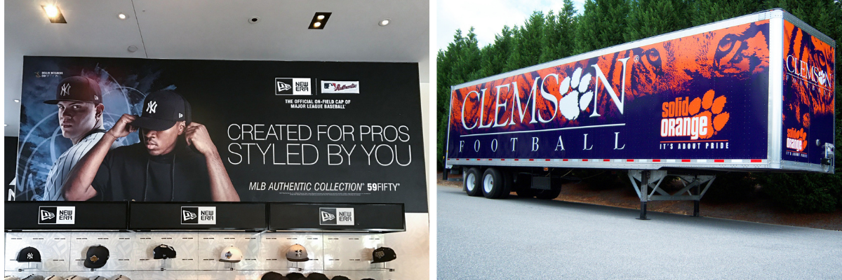
What Can Wide Format Printing Be Used For?
There are myriad applications that wide format printing can produce. Some of the most common include indoor and outdoor banners and signage, color proofing, fine art, packaging, point of purchase displays, photography, upholstery fabric, backlit boxes, vehicle wraps, floor graphics, wallpaper, apparel, flags, and even snowboards!
Of course, these applications depend on the type of ink and the type of substrate. When selecting an ink and substrate combination, it's important to take into consideration all the details of your final product's intended use. Will it be outdoors or indoors? Does it only need to be temporary, or will it need a longer use? Does it need to hold up to foot traffic, like a floor decal? Think through all the different uses you'll need to account for.
Planning Your Wide Format Print Project
Knowing where you'll be placing your final product will give you a better idea of how to design it effectively. If you can measure and mock up a dummy with plain paper, you'll be able to envision your workspace and plan accordingly. (It's not going to be fun if you get your final graphics in-hand and realize that you made them too big or too small for the space.)
You should also consider your audience. Would a fun die cut get more attention? Thinking outside the rectangle will make your project stand out even more.
The Best File Types To Use
Using Adobe Illustrator or a similar program to create a design using vector images is the best way to design for wide format printing. Vectors are infinitely scalable, meaning they can be enlarged without pixelation issues.
Of course, sometimes your design calls for photography or other raster images, and that's OK. Just remember this rule of thumb: images should be at least 150 dpi if you intend for it to be viewed up to 10 feet away. If you're designing for a greater distance, you still need to use a resolution of at least 60 dpi. The human eye perceives more of the image than is present, so distance can be a good thing if you don't have high-res images!
Design Tips for Wide Format Printing
- Keep It Simple
Embrace white space! It can be tempting to fill up a large space with a lot of elements, but you need a clear-cut, easy to read piece. A short message, an impactful graphic, and your logo and name are all you really need. (Your website might be good to include, too.) One-third of your total space should be blank when you're done. - Pay Attention to Color Choice
Limit the number of colors you use and use them to reinforce your brand. It's best to stick to CMYK, especially if your graphics include photos, but you can incorporate PMS colors if your brand has a strict standard. You also should consider the color contrast between the background and letters or other elements. - Double-check Font Readability
The entire purpose of your project is to be seen and understood, so make sure you choose highly legible fonts. Sans serif fonts are the best to use at a distance, with the exception of your brand name and/or tag line. Don't forget to pay attention to the spacing within the font, and adjust kerning if necessary.
- Proof From a Distance
Move across the room and view your design from a distance. Ask for a proof and view as the final will be. Gaining the perspective of distance is an important step in proofing your work.
Aug 04, 2021 |
Topics: Commercial Print, Retail, large format, Printing, wide format