It’s time to get technical! To understand why your printed piece doesn’t always match your computer screen, we need to dive into some basic color theory.
RGB
Light is subtractive, meaning when all wavelengths of light are present, the result is white. So when we filter red, green, and blue in different amounts, we can achieve the right wavelengths to create any visible color. This system is referred to as RGB. Computer monitors, televisions, and smartphones all use RGB. (Technology has moved away from using individual red, blue, and green cells and now we use programmable LEDs. This is what allows companies to design monitors and TVs with such high resolution and vivid color.)
CMYK
CMYK is an acronym for the colors cyan, magenta, yellow, and black. These are the four colors used in what is called process printing, or four-color process. Printing inks are additive, meaning the main colors are layered to build other colors. In color theory, when all three of the other colors (CMY) are printed at 100%, the result is black. So then why have a black ink?
In reality, printing 100% of cyan, magenta, and yellow results in a dark brownish-grayish color. True black is near impossible to make with a build because of the imperfect nature of manufacturing the inks.
Rich black is a term that describes a build of all four colors to create a darker black than just black ink alone can achieve. Remember, inks are additive, so the more you add, the darker it will become. To ensure a rich black, you can use the "registration" swatch in Adobe InDesign or build it yourself using 40% cyan, 40% magenta, 40% yellow, and 100% black.
One word of caution: getting a printing press to maintain registration (lining up all the colors perfectly) can be quite a challenge. It’s generally not recommended to use rich black for text or other fine lines because if the registration is off even a hair, it will be easy to spot.
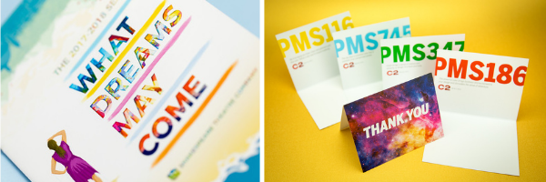
PMS
Even though RGB can give you any visible color, it’s nearly impossible to create all those colors with ink. CMYK builds can only achieve a certain range of colors. This is where PMS colors come in.
The Pantone Matching System (PMS) was created in the 1950s by a chemist who created the system to keep stock of different ink colors available. It gained popularity because of its usefulness as a reliable way to ensure color consistency. PMS swatchbooks show the exact same color to printing companies, designers, and print buyers around the world. But why go to all this trouble?
Picture Coca-Cola red. Have you ever seen it look a little orange, or a little pink? No, you haven’t! This is because the Coca-Cola company keeps strict control over their brand. They make sure that all printed items—from packaging to ads to billboards and more—are exactly matched to a custom color between PMS 484 and 485.
Deciding Which To Use
So how do you choose between printing with CMYK and PMS colors? The answer depends on many factors, like the amount of color in your project, how strict your brand guidelines are, and of course, your budget.
If you’re printing photographs, there’s no way you could achieve the full range of color using only PMS colors. Brochures, reports, postcards, or anything else using color photography will be its best when printed with CMYK.
Most PMS colors can be approximated by CMYK, (there is a PMS build book that your sales consultant can share with you, that shows the PMS color and what it will look at as a build of CMYK) so if your logo is PMS 484 and you’re ok with the way it looks when built, you’re good to go. Our digital presses have additional ink colors—orange, green, and violet—that can help expand the color range. In fact, they can reproduce up to 97% of all PMS colors!
But there are certain colors that simply can’t be built, especially metallics. In this case, you’ll need to add a fifth (or even sixth if your logo is two colors) color to CMYK. Your account manager can advise you on the best course of action.
Questions? This was pretty technical, and we've just scratched the surface. Do you still have questions? Ask your account manager for more details. Your question could be featured in an upcoming blog post!
May 26, 2021 |
Topics: Commercial Print, Color theory, Printing