6 Strategies to Enhance Your Visual Merchandising
Wednesday , 17 May 2023 | display, vomela, store decor, graphics and signage, Retail, holiday, magnetic signs, magna-mounts
Are you making the most out of visual merchandising for your retail store? What is your "looker-to-buyer" conversion rate? If you're striving to get a leg up on e-commerce competitors, you should be maximizing the effectiveness of your in-store presentation.
What is Visual Merchandising?
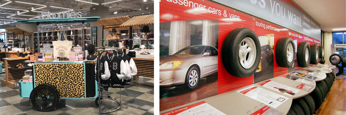
Any strategic placement, setting, or arrangement of products in a retail store is visual merchandising. The term also includes signs, displays, graphics, and fixtures that highlight the products. Visual merchandising is a way to market your products while capitalizing on our highly visual brains. (Statistically, 83% of the information we receive is from sight—so retailers need to make these strategies count.)
Not only does your visual merchandising strategy need to be eye-catching, it needs to be informative. Although more than 80% of people research products online before shopping, they can still be swayed if new or interesting information is presented. In-store displays detailing key features and benefits can lead to increased sales. Signage and displays can also suggest complementary products and boost sales through bundling.
No matter which of these strategies you consider using, always ensure that you're educating your audience.
Strategy 1: Immerse Your Audience
What better way to highlight the effectiveness of your products than to put them in their intended setting? When you immerse your audience into a scene, you're creating a lasting impression. Selling ski gear? Consider installing graphics on the walls that make the store or section feel as though the customer is on the mountain. Capitalize on custom fixtures and displays that fit into the setting. And don't forget about windows and floors! Incorporate informative text, but also use copy to evoke the exhilaration of flying down the slopes. The unifying theme and carefully crafted surroundings will tell the story of when, how, and why to use your products.
Strategy 2: Encourage Their Touchy-Feely Side
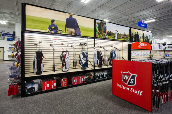
Most people who shop in-store want to be able to experience the products for themselves. They aren't content to rely on even the most interactive online shopping experience. Embrace this desire to touch and feel the products by creating displays that encourage their participation. Think about the Apple store; all products are displayed in a setting that practically cries out to be touched. Using the products in the store feels almost mandatory! This strategy can work no matter what you're selling, from tires to toothbrushes. You just need to encourage people (i.e. give them instructions) through your graphics, fixtures, and displays.

Strategy 3: Light Up Their Lives
Light is a critical part of our visual processing. The right lighting can make or break a sale, control a consumer's perspective, and set the mood for your store. Take this a step further by incorporating backlit signs and light-up displays for your products. Vomela's experience designing and printing backlit signs combined with new LED technologies offers endless creative opportunities. Engaging visual merchandising like this is eye-catching and provides a unique buying experience.
Strategy 4: Color Outside the Lines
Color is another key element of our visual processing, and retailers and brand that know how to wield it are seeing massive payoffs. Branding—whether at the company or product level—is critical in some markets. Consider Tiffany & Co. Their "Tiffany blue" is iconic in the high-end jewelry space. Now what happens when they take a step away from that strong color and create displays using equally bold, but very different colors? Consumers may love it or hate it, but they certainly won't pass by without noticing. When designing your displays, keep in mind the basics of color theory and position your graphics and merchandising elements accordingly.
Strategy 5: Provoke Engagement with Themes
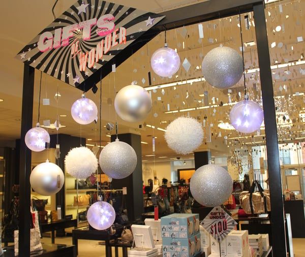
Everyone groans when the Christmas displays pop up seemingly earlier each year. But one thing retailers know how to do is instill the Christmas spirit into buyers. Thematic merchandising is similar to the immersive experience above, but perhaps on a smaller scale. Interchangeable magnetic signage is a great system for capitalizing on even smaller holidays and events. With the ability to easily swap out graphics, promo information, and branding, your employees can go from Mother's Day to Memorial Day in a snap.

Strategy 6: Embrace Localization
Franchising and multiple store locations are the norm for major retailers. But consumers are becoming more and more interested in the "shop small" movement and hometown pride. The best way to bridge this gap is to localize your stores. Incorporate visuals that embrace each location, calling out landmarks, history, and the overall vibe of the area. For example, if your store is in Newberry, SC, you could include a mural of its historic Opera House. If the location is in Northport, NY, you could feature native daughter Patti LuPone. Spend some time researching what makes each location unique, and most importantly, what its residents are proud of.
These strategies are by no means all-encompassing. With your creative ideas and Vomela's capabilities, the possibilities are endless. Make the most of visual merchandising for your retail store and watch the sales roll in! Contact us to implement some of these ideas.
May 17, 2023 |
Topics: display, vomela, store decor, graphics and signage, Retail, holiday, magnetic signs, magna-mounts
